Real outputs, made by Decky

Every slide, one-pager and social post shown on this site. Each brand is a sample workspace set up from a template and guidelines, then asked for work in a sentence.

Meridian
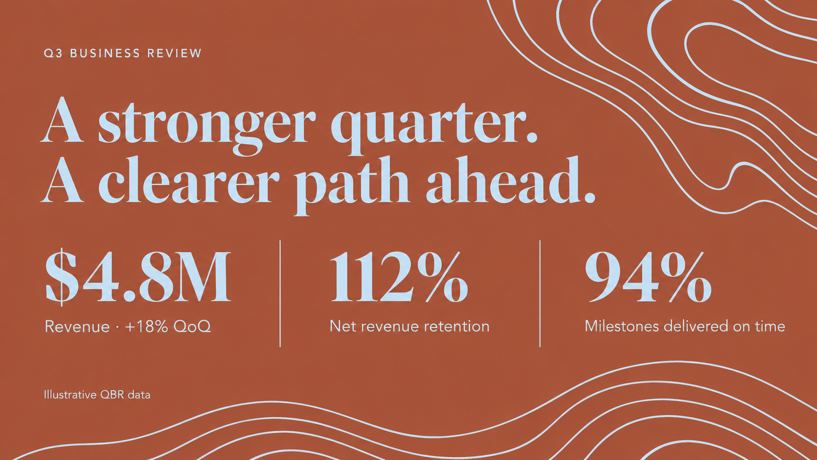
  • Meridian Q3 business review slide made by Decky: rust-orange background with pale-blue topographic line art, a large cream serif headline “A stronger quarter. A clearer path ahead.” and three big serif metrics — $4.8M revenue, 112% net revenue retention, 94% milestones on time — divided by thin rules.

    Q3 business review

    Meridian · Slide · Inputs: Brand template (.pptx) and guidelines (PDF), Q3 metrics

    An opening QBR slide in Meridian's rust and pale-blue system. Decky set the headline in the brand serif and laid out three headline metrics with the thin dividing rules from the template.
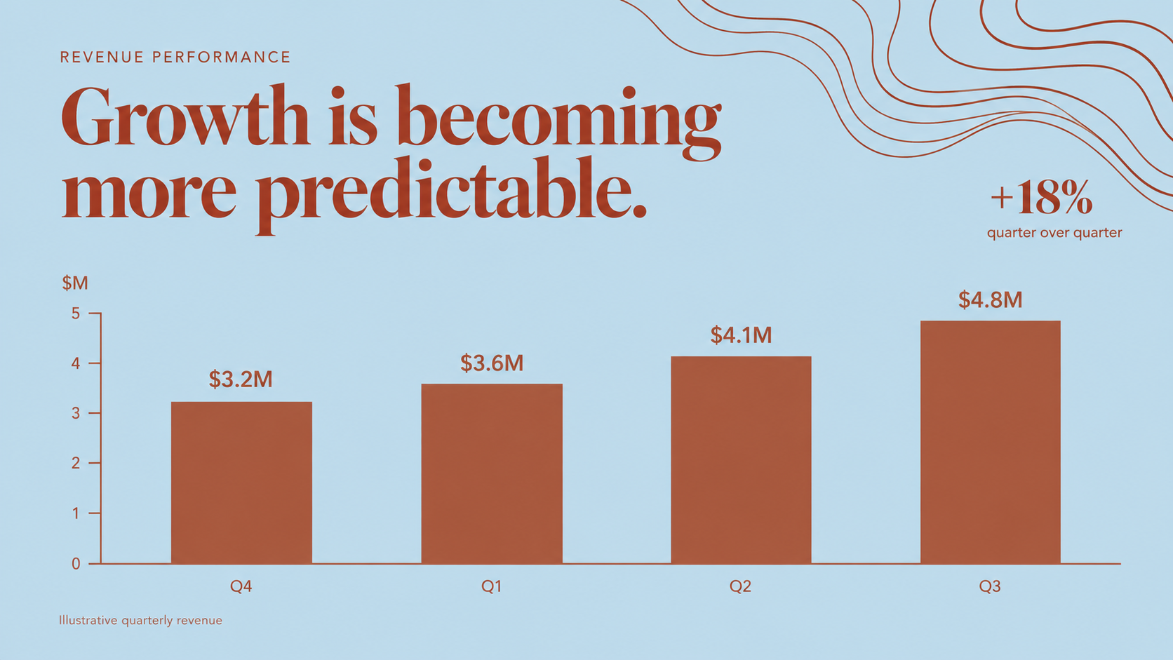
  • Meridian revenue performance slide made by Decky: pale-blue background, rust serif headline “Growth is becoming more predictable.”, a rust bar chart rising from $3.2M to $4.8M across four quarters, and a +18% quarter-over-quarter callout.

    Quarterly revenue chart

    Meridian · Slide · Inputs: Brand template (.pptx) and guidelines (PDF), quarterly revenue CSV

    A data slide built from a small revenue table. Decky drew the bar chart in the brand's rust color on its pale-blue background and pulled out the quarter-over-quarter change as a callout.

  • Meridian customer spotlight slide made by Decky: split layout with a rust panel on the left holding the cream serif headline “Better handoffs. Faster delivery.” and two metrics, 24% and 91%, beside a photo of three colleagues reviewing plans at a laptop in a workshop.

    Customer spotlight

    Meridian · Slide · Inputs: Brand template (.pptx) and guidelines (PDF), customer story notes

    A half-photo, half-text customer story slide. The copy panel keeps Meridian's serif and rust color while the photo carries the human side of the story.
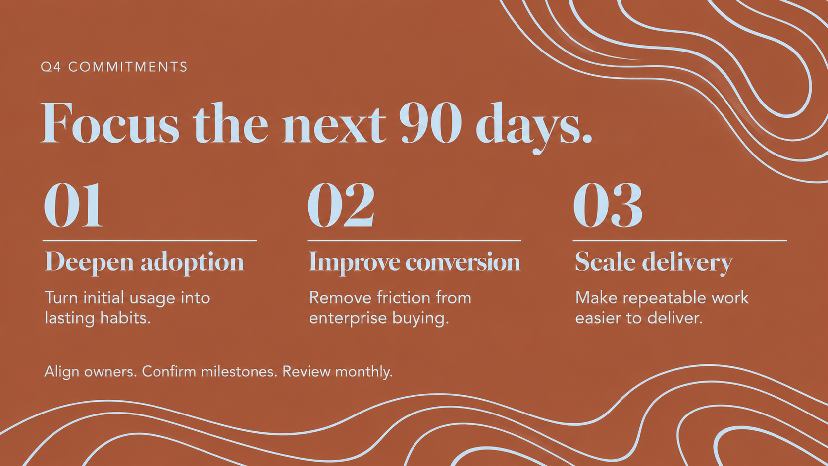
  • Meridian Q4 commitments slide made by Decky: rust background with pale-blue wave lines, cream serif headline “Focus the next 90 days.” and three numbered columns — 01 Deepen adoption, 02 Improve conversion, 03 Scale delivery — each with a short description.

    Q4 commitments

    Meridian · Slide · Inputs: Brand template (.pptx) and guidelines (PDF), planning notes

    A three-column priorities slide for the next quarter. Large serif numerals and underlines come straight from Meridian's template so the plan reads at a glance.
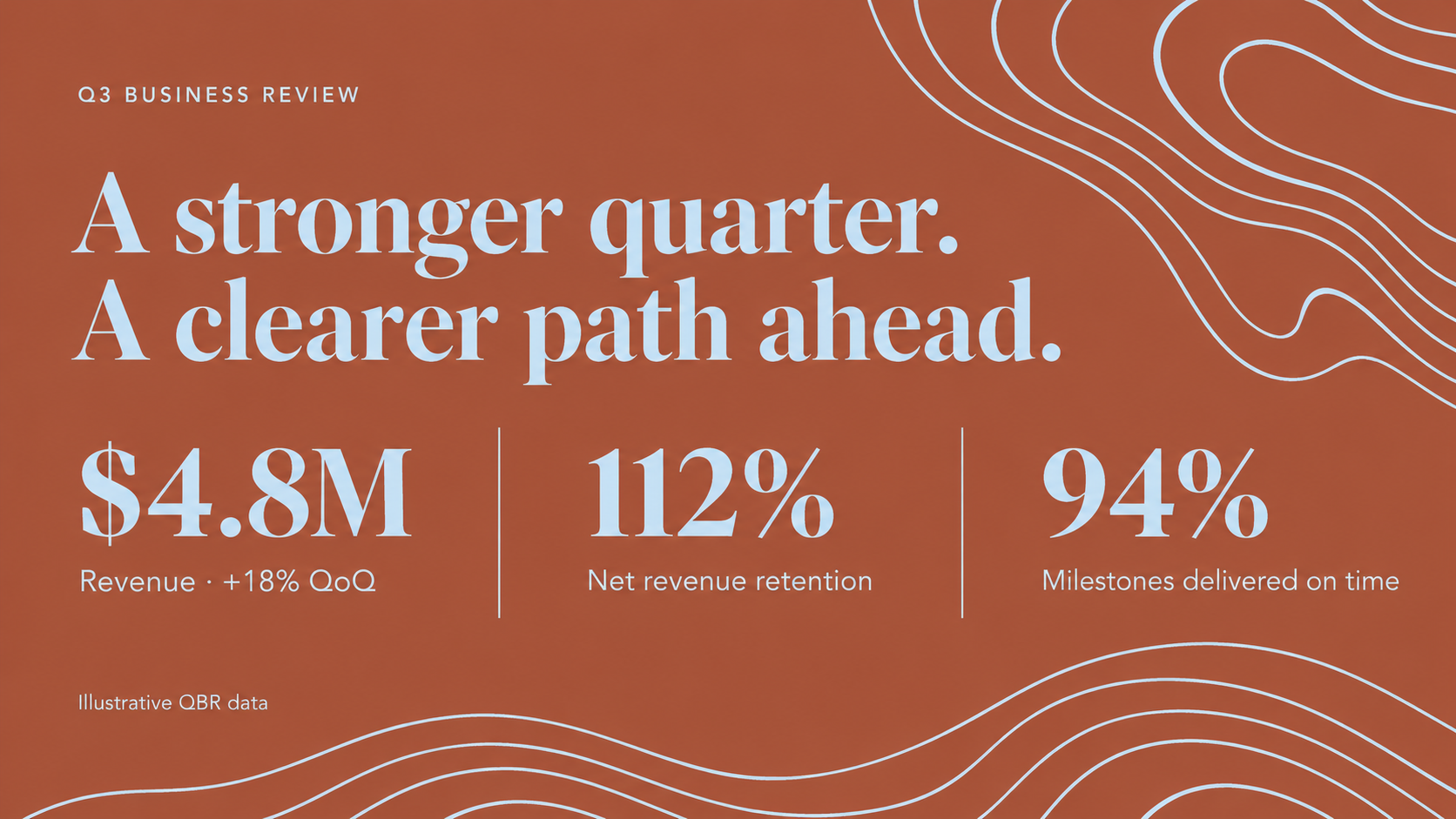
  • Meridian Q3 leadership review slide made by Decky: rust-orange background with pale-blue contour lines, cream serif headline “A stronger quarter. A clearer path ahead.” and three large metrics separated by thin vertical rules.

    Q3 leadership review

    Meridian · Slide · Inputs: Brand template (.pptx) and guidelines (PDF), Q3 metrics, a one-line Slack request

    The slide Decky returns for a quick leadership-review request in Slack. It keeps Meridian's rust palette, serif headline and three-metric layout.
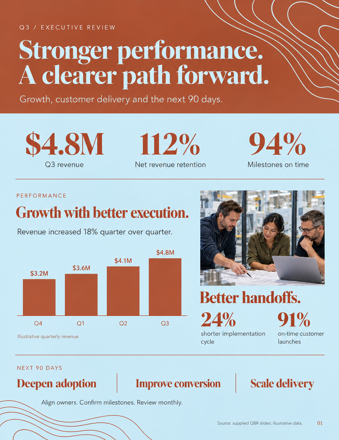
  • Meridian Q3 executive review one-pager made by Decky: rust header band with a cream serif headline, a pale-blue body with three serif metrics, a small rust bar chart of quarterly revenue, a team photo, and a footer row of next-90-day priorities.

    Q3 executive review

    Meridian · One-pager · Inputs: Brand template (.pptx) and guidelines (PDF), Q3 metrics, quarterly revenue CSV

    The same quarter condensed into a printable page. Decky reflowed the slide content into a vertical layout with a header band, metrics row, chart, photo and priorities.

PlentyLoop
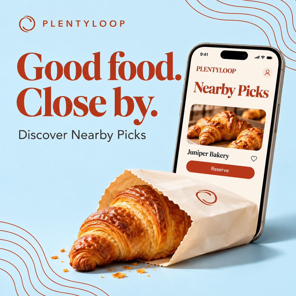
  • PlentyLoop square social post made by Decky: light-blue background with rust contour lines, rust serif headline “Good food. Close by.”, the line “Discover Nearby Picks”, and a phone showing the Nearby Picks app beside a croissant spilling from a paper bag.

    Nearby Picks launch post

    PlentyLoop · Social post · Inputs: Brand template (.pptx) and guidelines (PDF), product launch brief, app screenshot

    A square launch post for a food-rescue app. Decky paired the brand's rust serif with a product photo and phone mockup, sized for social feeds.
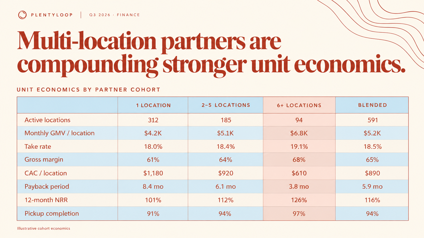
  • PlentyLoop finance slide made by Decky: cream background with rust contour lines, rust serif headline “Multi-location partners are compounding stronger unit economics.” above a pale-blue table of eight metrics across 1, 2–5 and 6+ location cohorts, with the 6+ column highlighted in pink.

    Unit economics

    PlentyLoop · Slide · Inputs: Brand template (.pptx) and guidelines (PDF), cohort data (.csv)

    A finance table slide built from cohort data. Decky highlighted the strongest cohort column so the point of the slide is obvious.
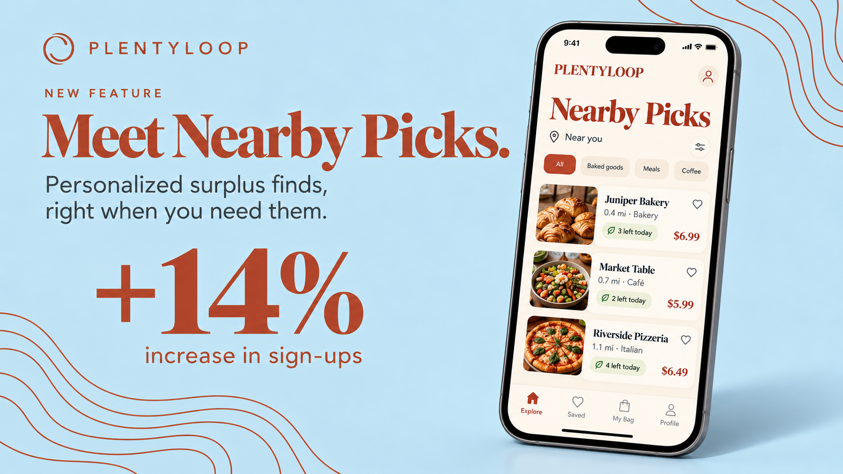
  • PlentyLoop product launch slide made by Decky: pale-blue background with rust contour lines, rust serif headline “Meet Nearby Picks.”, a large “+14% increase in sign-ups” stat, and a phone showing the Nearby Picks list of bakeries and restaurants.

    Nearby Picks launch

    PlentyLoop · Slide · Inputs: Brand template (.pptx) and guidelines (PDF), launch brief, app screenshot

    A feature launch slide with one big result and the app on a phone. Serif type and contour lines come from PlentyLoop's template.

Brightline
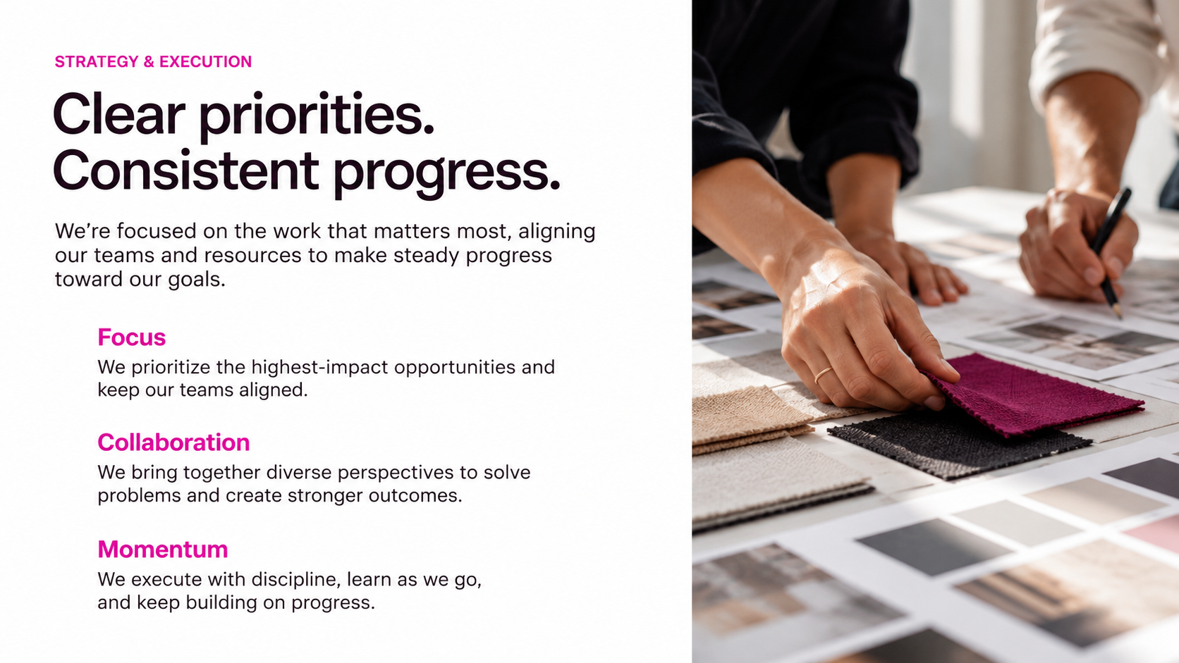
  • Brightline strategy and execution slide made by Decky: white background, bold black sans-serif headline “Clear priorities. Consistent progress.”, three magenta subheads — Focus, Collaboration, Momentum — with short descriptions, and a photo of hands marking up magenta fabric swatches on the right.

    Strategy and execution

    Brightline · Slide · Inputs: Brand template (.pptx) and guidelines (PDF), strategy notes

    A clean text-and-photo strategy slide. Magenta accents mark each pillar while the tight black sans headline keeps it in Brightline's voice.
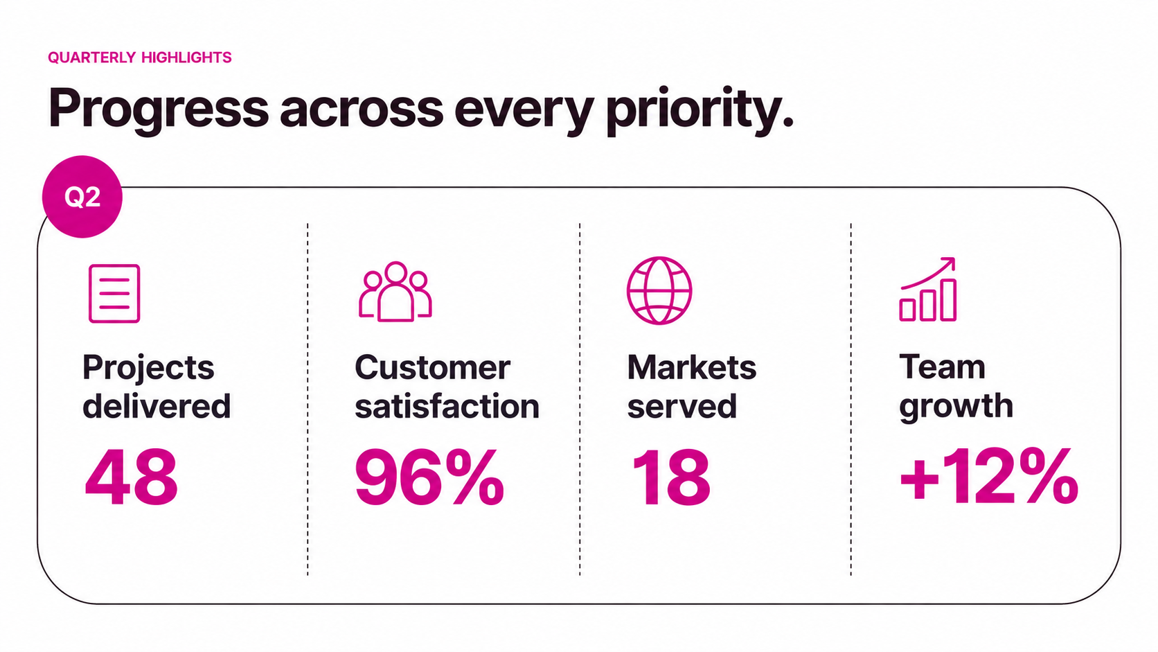
  • Brightline Q2 highlights slide made by Decky: white background, black sans headline “Progress across every priority.”, a rounded outline card with a magenta Q2 badge and four line icons over large magenta figures — 48 projects delivered, 96% customer satisfaction, 18 markets served, +12% team growth.

    Q2 highlights

    Brightline · Slide · Inputs: Brand template (.pptx) and guidelines (PDF), Q2 KPI sheet

    A four-KPI dashboard slide. Decky placed each number under a matching line icon inside a single outlined card using Brightline's magenta for emphasis.
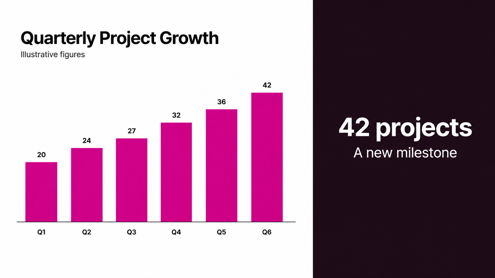
  • Brightline quarterly project growth slide made by Decky: magenta bar chart rising from 20 to 42 projects across six quarters on white, with a near-black side panel reading “42 projects — A new milestone.”

    Quarterly project growth

    Brightline · Slide · Inputs: Brand template (.pptx) and guidelines (PDF), project counts CSV

    A chart slide that turns a short data file into a milestone story. The dark side panel calls out the headline number next to the magenta bars.
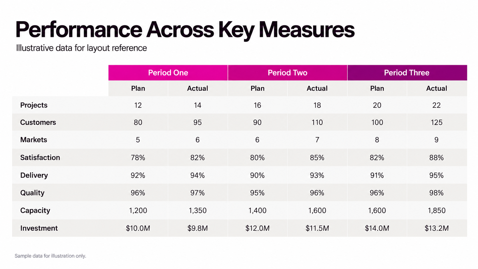
  • Brightline performance table slide made by Decky: bold black sans headline “Performance Across Key Measures” above a plan-versus-actual table across three periods, with magenta-to-purple header cells and eight rows from Projects to Investment.

    Plan vs actual

    Brightline · Slide · Inputs: Brand template (.pptx) and guidelines (PDF), performance spreadsheet (.xlsx)

    A dense table made readable. Decky grouped plan and actual columns under colored period headers and kept generous row spacing.
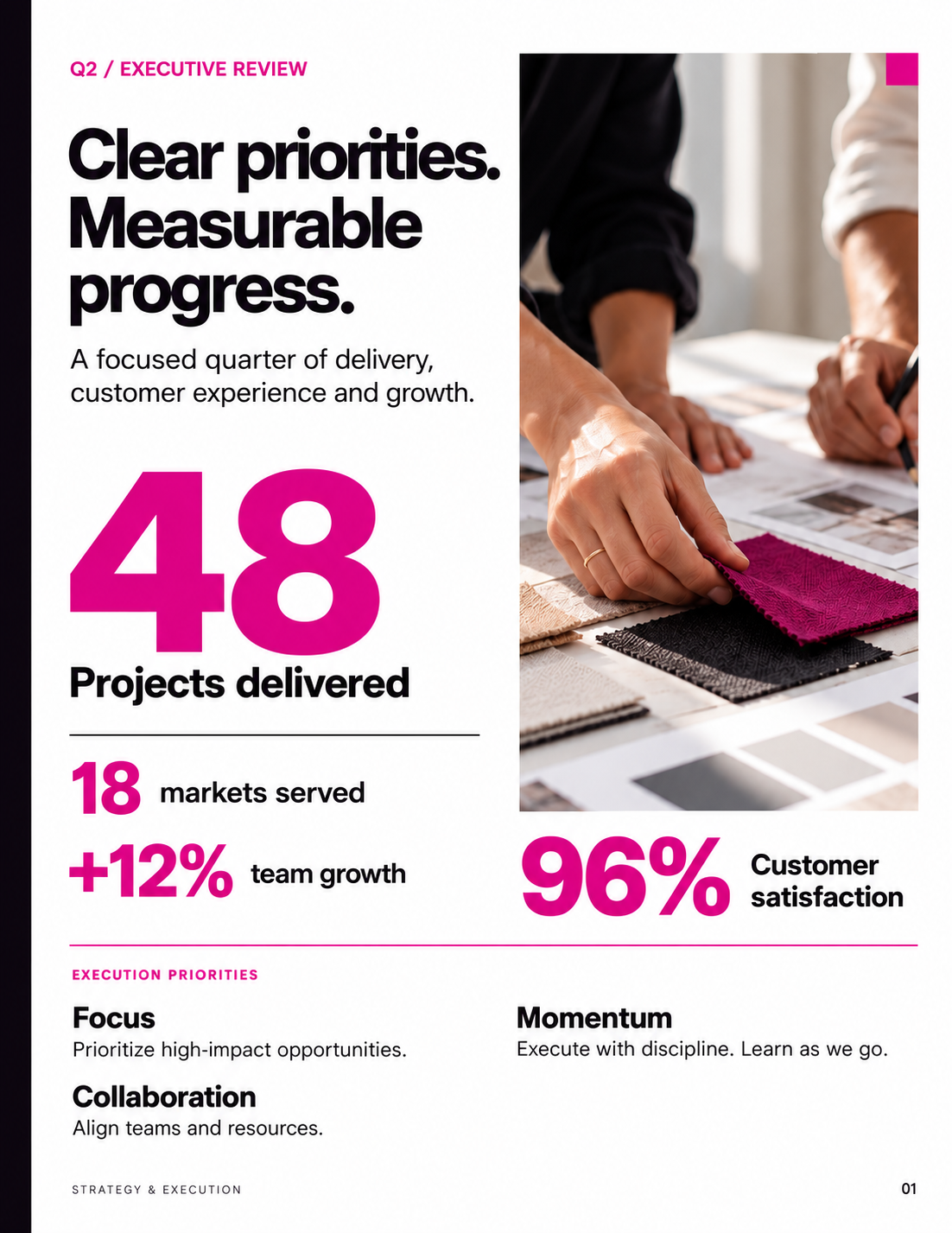
  • Brightline Q2 executive review one-pager made by Decky: white page with a black sans headline “Clear priorities. Measurable progress.”, an oversized magenta “48 projects delivered”, smaller magenta stats, a fabric-swatch photo, and a three-item execution priorities footer.

    Q2 executive review

    Brightline · One-pager · Inputs: Brand template (.pptx) and guidelines (PDF), Q2 KPI sheet

    Brightline's quarter on one page. A giant magenta number anchors the layout, with supporting stats and priorities stacked below.
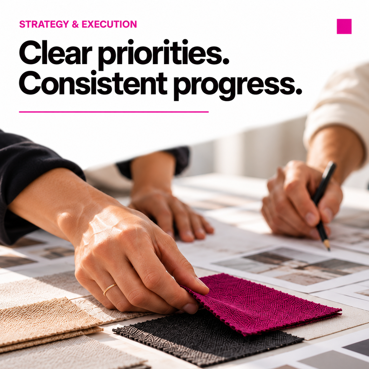
  • Brightline square social post made by Decky: white top band with a magenta eyebrow and bold black sans headline “Clear priorities. Consistent progress.”, over a close-up photo of hands marking up magenta fabric swatches.

    Clear priorities post

    Brightline · Social post · Inputs: Brand template (.pptx) and guidelines (PDF), strategy notes

    The strategy message cut down for social. Headline on top, brand photo below, magenta used sparingly.

Fernbrook

  • Fernbrook strategy cover slide made by Decky: deep forest-green background, cream serif title “A future worth building” with the subline “A practical path to resilient growth”, and a lush fern wreath photographed on the right.

    Strategy cover

    Fernbrook · Slide · Inputs: Brand template (.pptx) and guidelines (PDF), strategy outline

    A calm, editorial cover in Fernbrook's forest green. The fern wreath photo and cream serif set the tone for a long-term strategy deck.
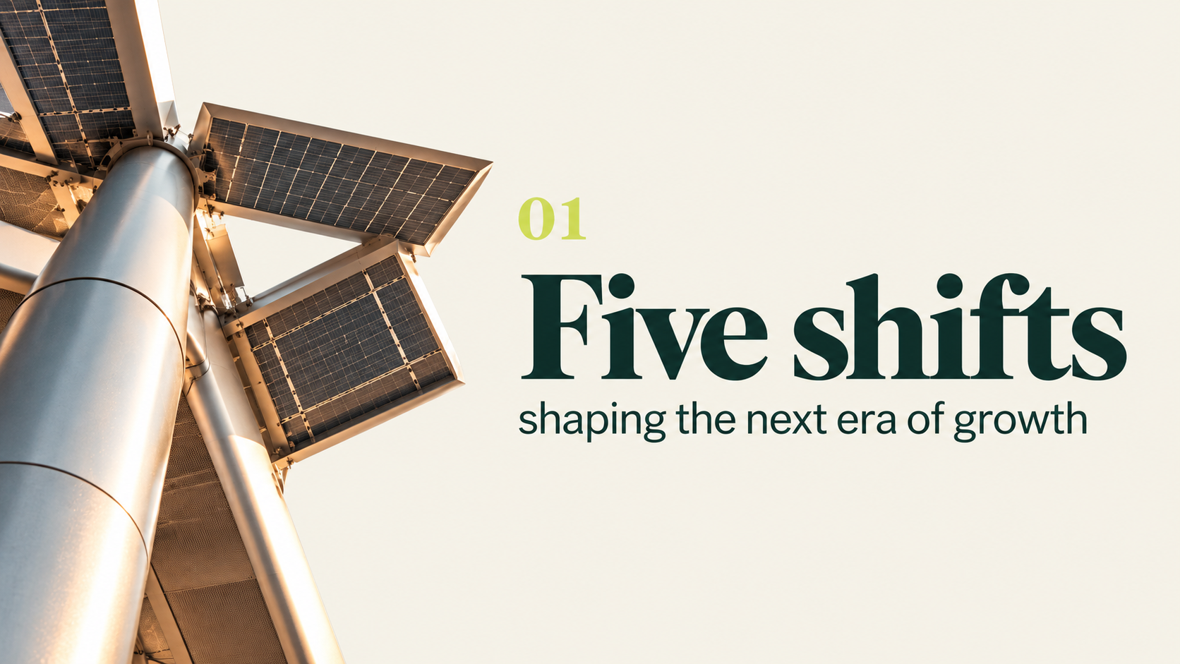
  • Fernbrook section divider slide made by Decky: cream background, chartreuse numeral “01”, large forest-green serif “Five shifts” with “shaping the next era of growth”, beside a photo of solar panels on a tall pole.

    Five shifts section

    Fernbrook · Slide · Inputs: Brand template (.pptx) and guidelines (PDF), strategy outline

    A section opener that introduces the deck's five shifts. Decky used the brand's chartreuse numeral and serif display type with an on-theme energy photo.
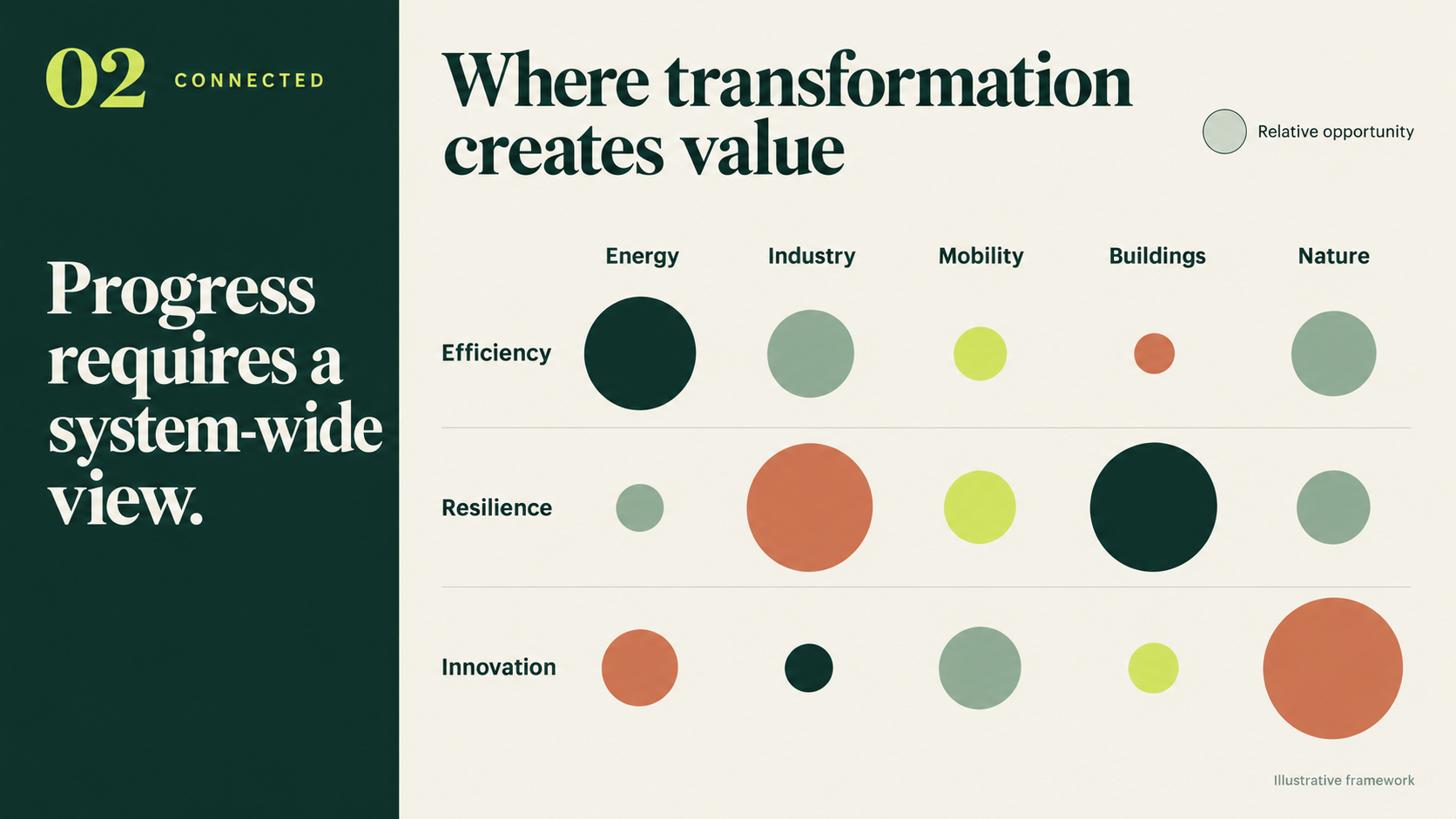
  • Fernbrook value matrix slide made by Decky: forest-green side panel reading “Progress requires a system-wide view.” beside a bubble matrix on cream comparing Efficiency, Resilience and Innovation across Energy, Industry, Mobility, Buildings and Nature, with circles in green, sage, chartreuse and terracotta sized by opportunity.

    Transformation value matrix

    Fernbrook · Slide · Inputs: Brand template (.pptx) and guidelines (PDF), opportunity scoring table

    A bubble matrix built from a scoring table. Circle size shows relative opportunity, colored with Fernbrook's four-tone palette.
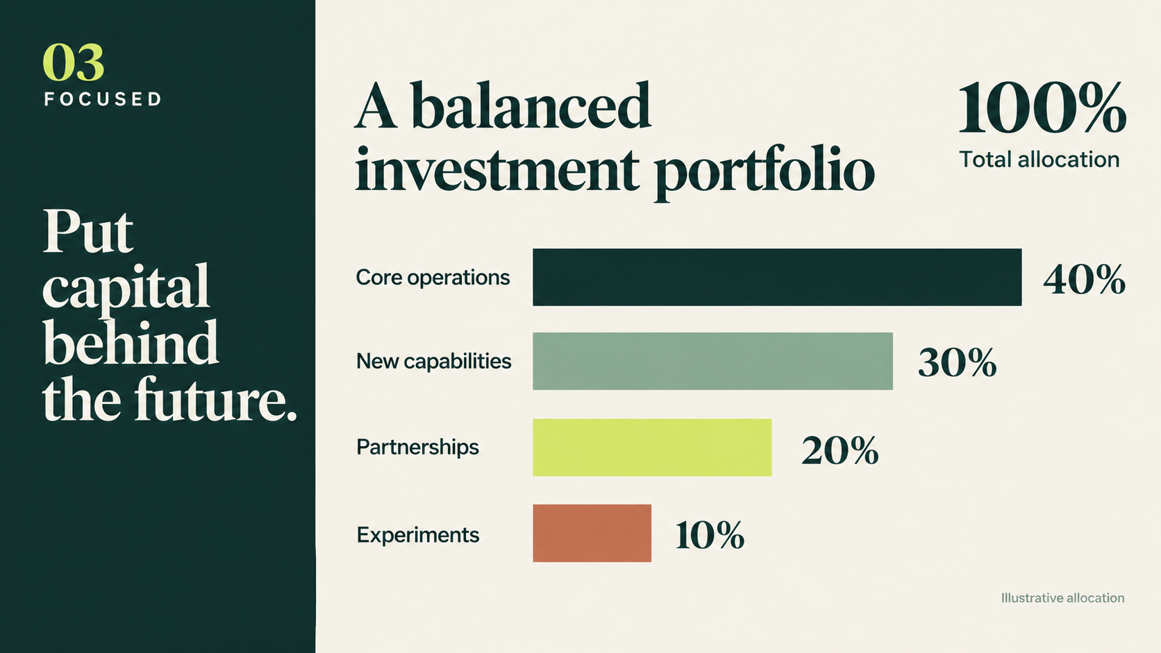
  • Fernbrook investment portfolio slide made by Decky: forest-green side panel “Put capital behind the future.” and a horizontal bar chart on cream — Core operations 40%, New capabilities 30%, Partnerships 20%, Experiments 10% — in green, sage, chartreuse and terracotta.

    Investment allocation

    Fernbrook · Slide · Inputs: Brand template (.pptx) and guidelines (PDF), allocation figures

    A simple allocation chart in brand colors. Each bar uses a different Fernbrook tone so the split reads without a legend.
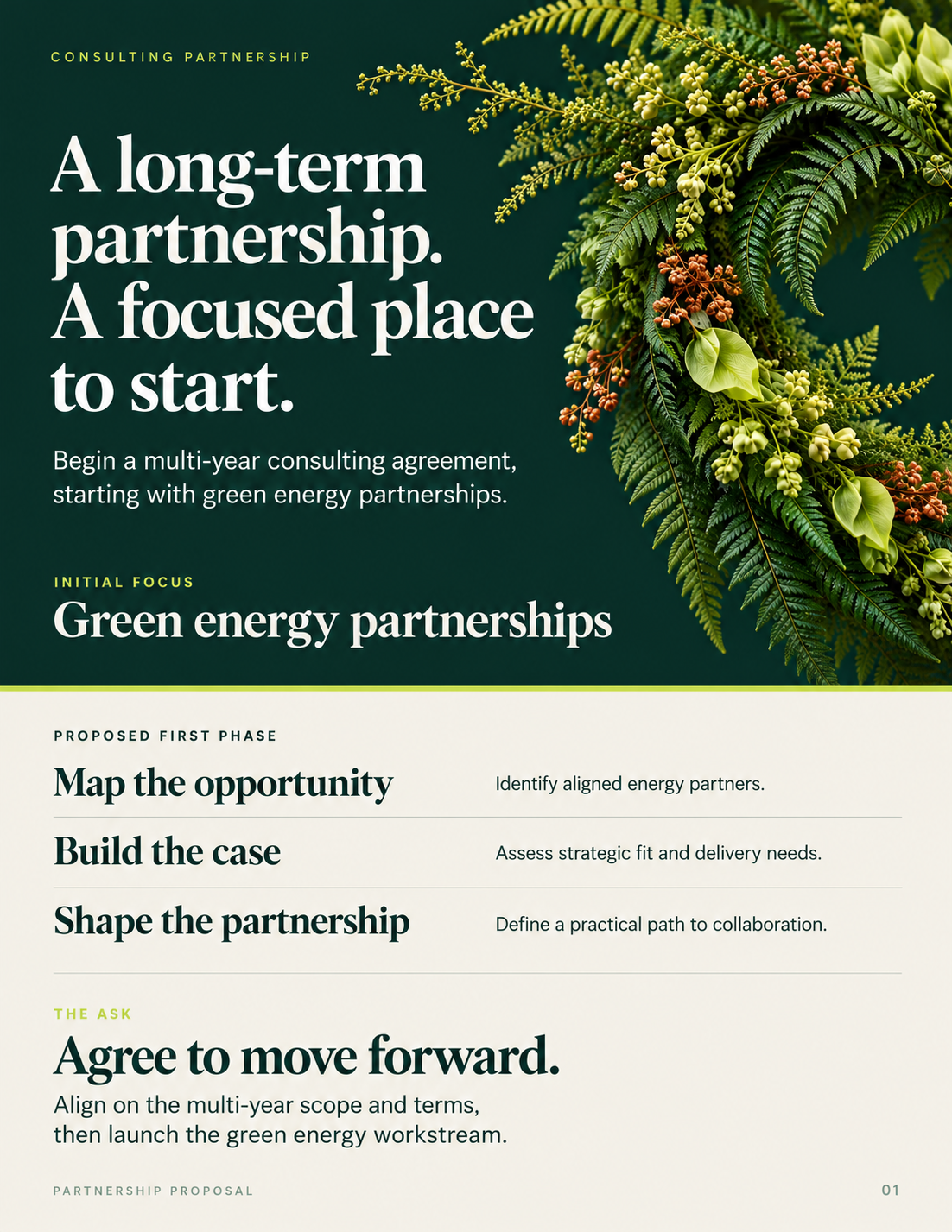
  • Fernbrook partnership proposal one-pager made by Decky: forest-green top half with a cream serif headline “A long-term partnership. A focused place to start.” and fern foliage, above a cream section listing three first-phase steps and a closing “Agree to move forward.”

    Partnership proposal

    Fernbrook · One-pager · Inputs: Brand template (.pptx) and guidelines (PDF), proposal notes

    A one-page consulting proposal. The green header carries the pitch and the cream lower half lists the first phase in plain steps.

  • Fernbrook square social post made by Decky: deep forest-green background, chartreuse letter-spaced eyebrow “Green energy partnerships”, cream serif headline “A future worth building. Together.” and ferns framing the right and bottom edges.

    Future worth building post

    Fernbrook · Social post · Inputs: Brand template (.pptx) and guidelines (PDF), campaign line

    Fernbrook's campaign line as a square post. Serif headline, fern framing and the brand's forest green.

Summer Stand
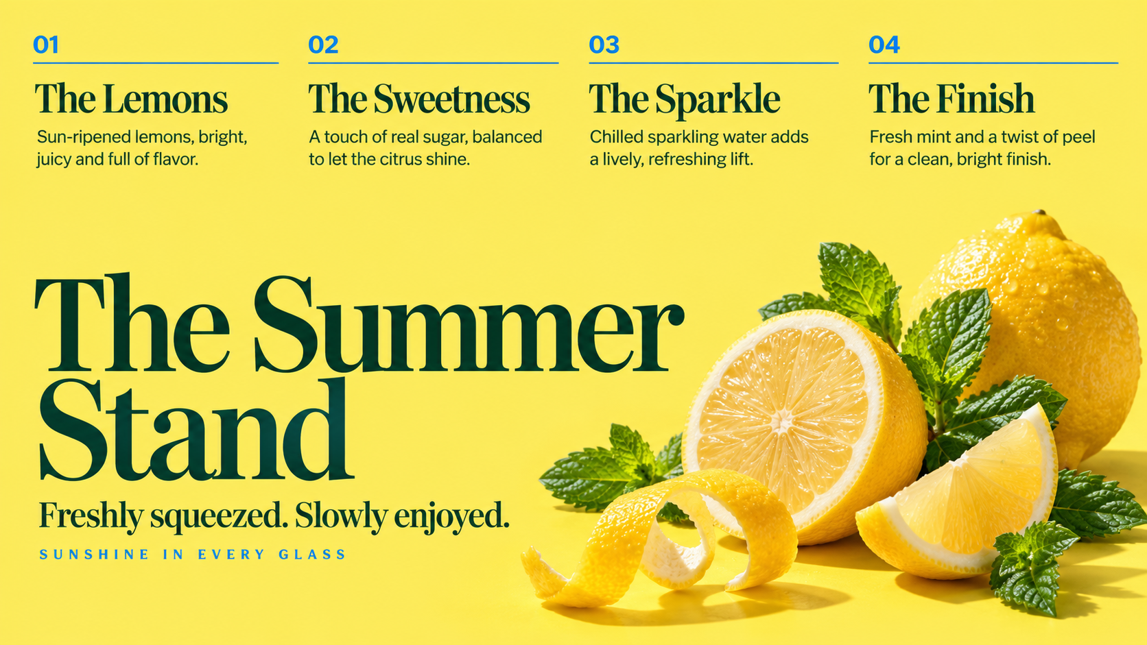
  • Summer Stand cover slide made by Decky: bright lemon-yellow background, deep-green serif title “The Summer Stand — Freshly squeezed. Slowly enjoyed.”, a four-column header (The Lemons, The Sweetness, The Sparkle, The Finish) and a photo of halved lemons and mint.

    Lemonade stand cover

    Summer Stand · Slide · Inputs: Brand template (.pptx) and guidelines (PDF), product notes

    A cheerful cover in Summer Stand's yellow and deep green. Four ingredient columns run across the top above the serif title and fruit photography.
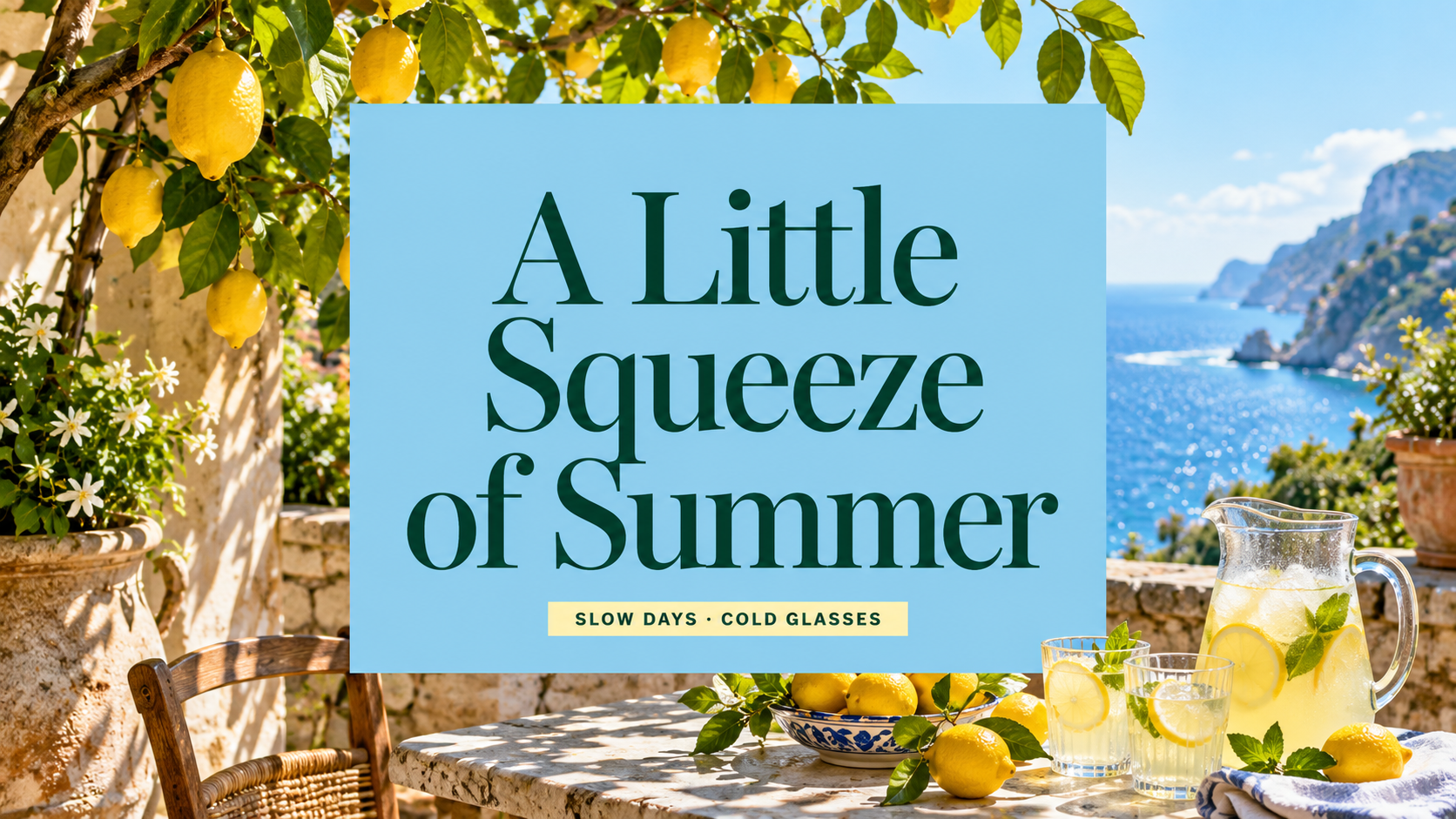
  • Summer Stand slide made by Decky: Mediterranean seaside terrace photo with lemon trees and a pitcher of lemonade, overlaid with a sky-blue panel holding the deep-green serif headline “A Little Squeeze of Summer”.

    A little squeeze of summer

    Summer Stand · Slide · Inputs: Brand template (.pptx) and guidelines (PDF), campaign line

    A full-bleed photo slide with a centered sky-blue title panel. Decky kept the headline in the brand serif and colors over the photo.
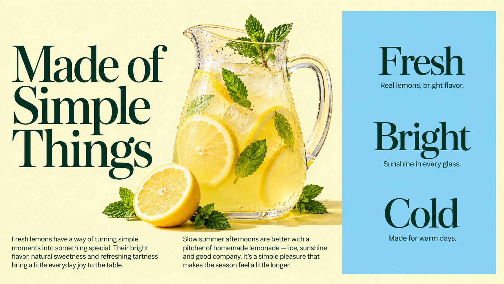
  • Summer Stand slide made by Decky: cream background, deep-green serif headline “Made of Simple Things”, a photo of a lemonade pitcher with mint, and a sky-blue column listing Fresh, Bright and Cold with short taglines.

    Fresh, bright, cold

    Summer Stand · Slide · Inputs: Brand template (.pptx) and guidelines (PDF), product notes

    A product-values slide in three words. The sky-blue column lists the values next to a lemonade photo.
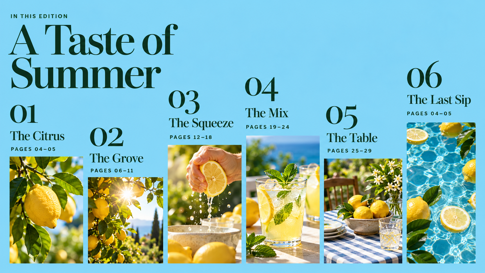
  • Summer Stand contents slide made by Decky: sky-blue background, deep-green serif title “A Taste of Summer” and six numbered photo columns of staggered height — The Citrus, The Grove, The Squeeze, The Mix, The Table, The Last Sip — with page ranges.

    A taste of summer contents

    Summer Stand · Slide · Inputs: Brand template (.pptx) and guidelines (PDF), edition outline

    A magazine-style table of contents. Staggered photo columns give each chapter its own image and page range.
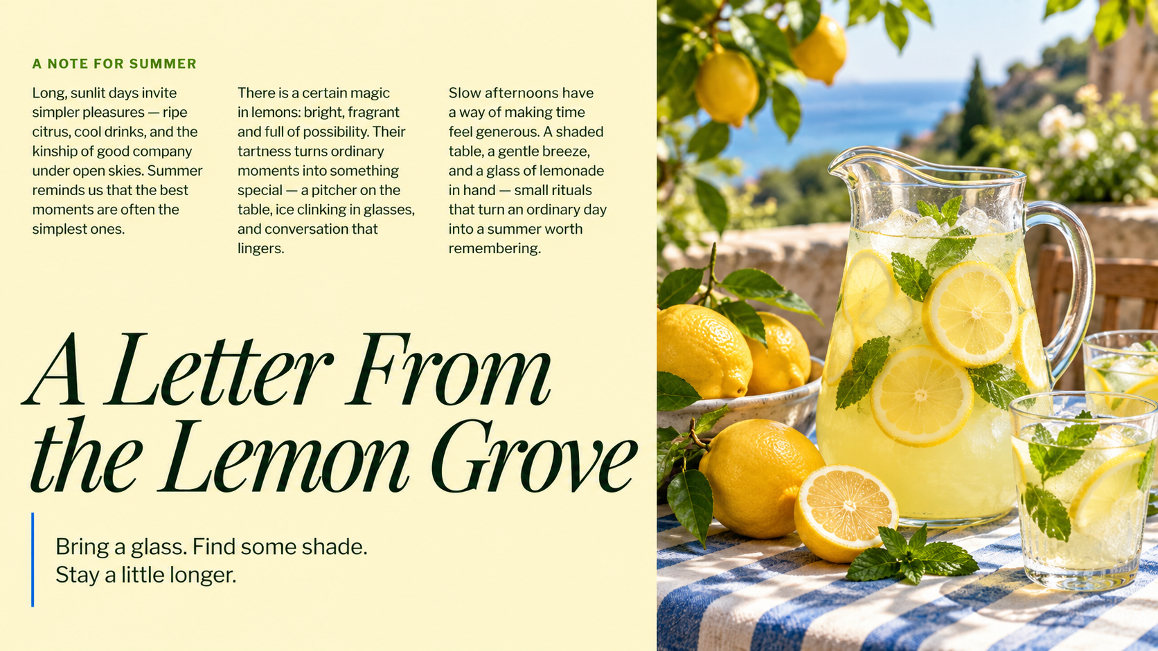
  • Summer Stand editorial slide made by Decky: pale-yellow left half with three columns of small body text and a large deep-green serif title “A Letter From the Lemon Grove”, beside a photo of a lemonade pitcher on a blue gingham table by the sea.

    Letter from the lemon grove

    Summer Stand · Slide · Inputs: Brand template (.pptx) and guidelines (PDF), letter copy (.md)

    A long-form letter set as an editorial spread. Decky flowed the markdown copy into three columns opposite a seaside photo.
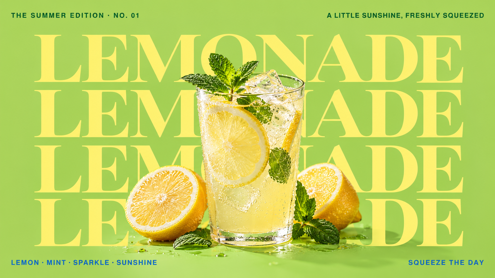
  • Summer Stand poster slide made by Decky: lime-green background with the word LEMONADE repeated four times in huge pale-yellow serif capitals behind a glass of sparkling lemonade with lemon halves and mint.

    Summer edition poster

    Summer Stand · Slide · Inputs: Brand template (.pptx) and guidelines (PDF), campaign line

    A bold typographic poster slide. Repeated display type sits behind the product photo for a summer-edition feel.
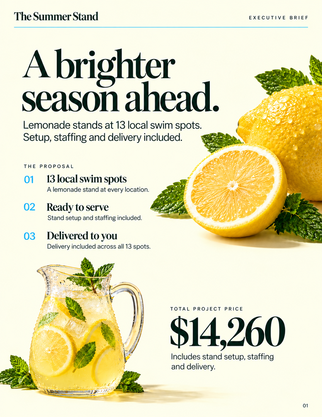
  • Summer Stand executive brief one-pager made by Decky: cream page with a deep-green serif headline “A brighter season ahead.”, a three-step proposal for 13 local swim spots, photos of a lemon and a lemonade pitcher, and a large $14,260 total project price.

    Swim spot proposal

    Summer Stand · One-pager · Inputs: Brand template (.pptx) and guidelines (PDF), pricing sheet (.csv)

    A one-page proposal with pricing. Steps, imagery and a clear total are laid out in Summer Stand's cream, green and yellow.
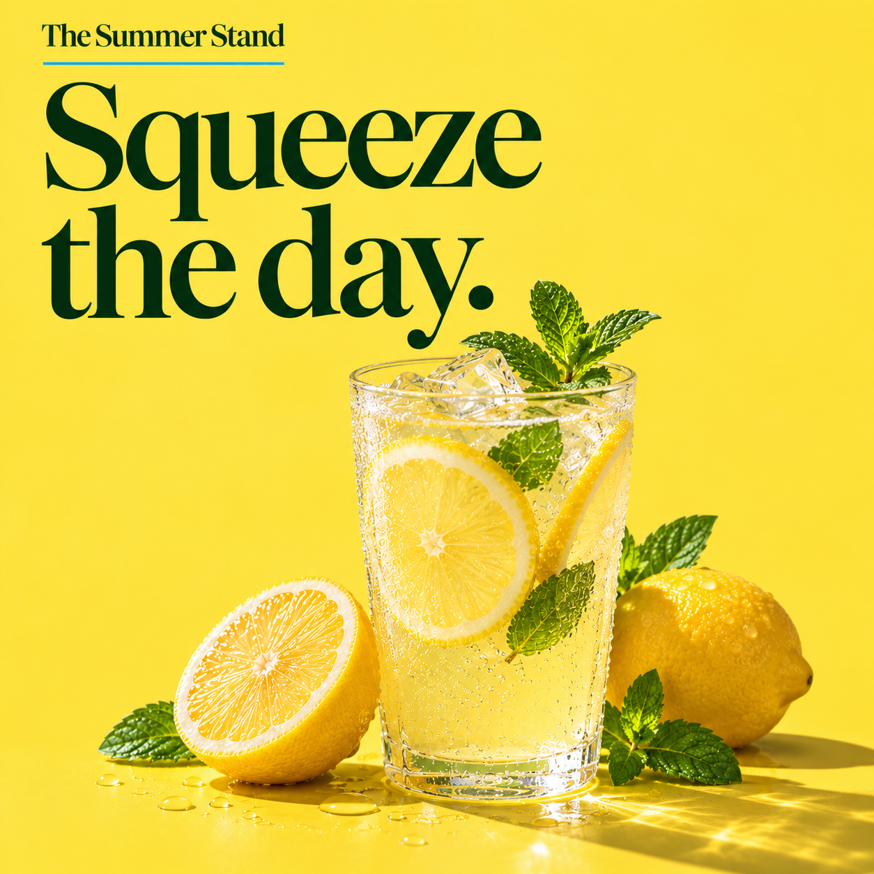
  • Summer Stand square social post made by Decky: sunny yellow background, deep-green serif headline “Squeeze the day.” and a glass of iced lemonade with mint and lemon halves.

    Squeeze the day post

    Summer Stand · Social post · Inputs: Brand template (.pptx) and guidelines (PDF), campaign line

    A simple square post: one line of serif type and one product photo on brand yellow.

Orbit Press
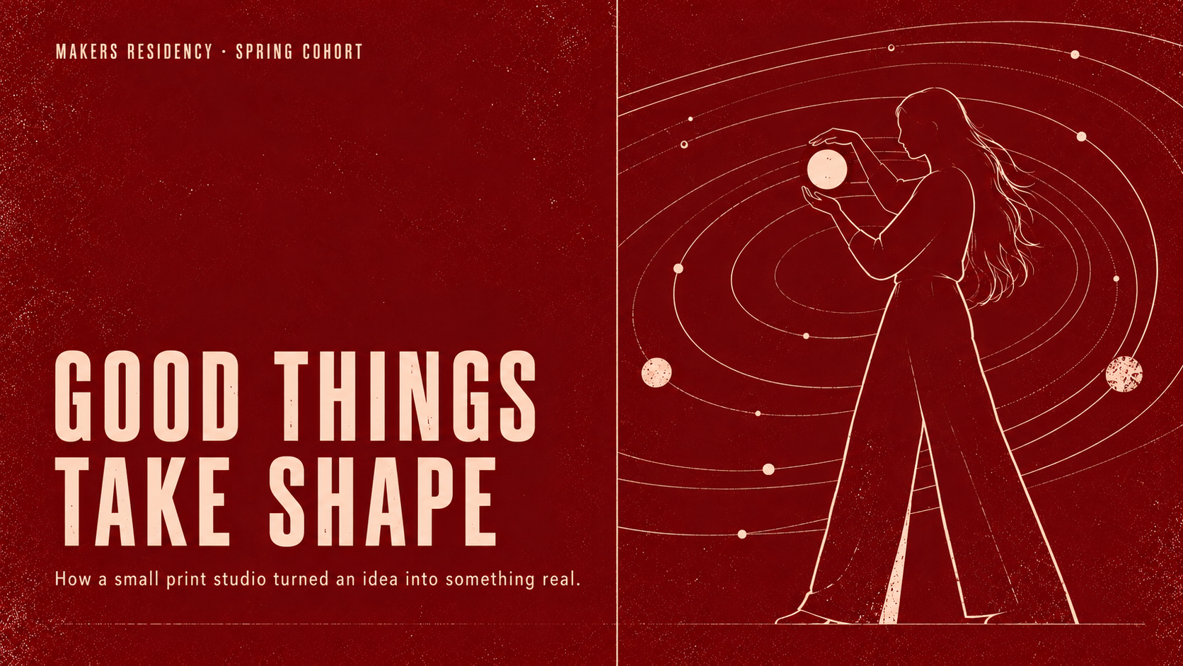
  • Orbit Press cover slide made by Decky: deep oxblood-red background with grain texture, tall blush-cream condensed capitals “GOOD THINGS TAKE SHAPE”, and a line illustration of a woman holding a glowing orb among orbit rings.

    Good things take shape

    Orbit Press · Slide · Inputs: Brand template (.pptx) and guidelines (PDF), workshop outline

    A risograph-style cover for a makers residency. Condensed caps and a single-color orbit illustration carry the print-studio brand.
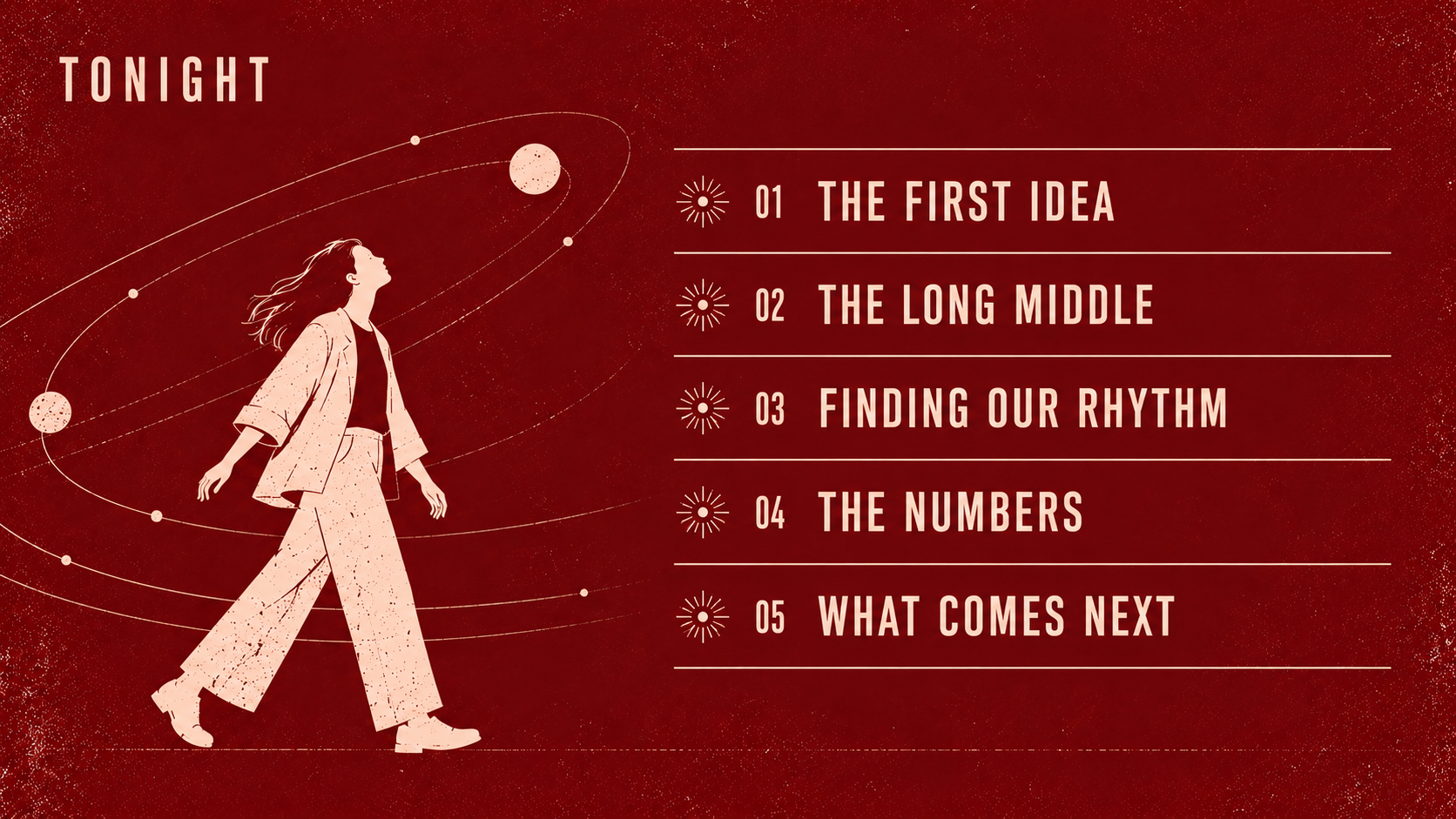
  • Orbit Press agenda slide made by Decky: oxblood-red textured background, condensed cream caps “TONIGHT” and a five-item ruled agenda list from The First Idea to What Comes Next, beside an illustration of a woman walking among orbiting planets.

    Tonight's agenda

    Orbit Press · Slide · Inputs: Brand template (.pptx) and guidelines (PDF), event agenda

    An event agenda in five lines. Thin rules and starburst bullets match the brand's printed look.
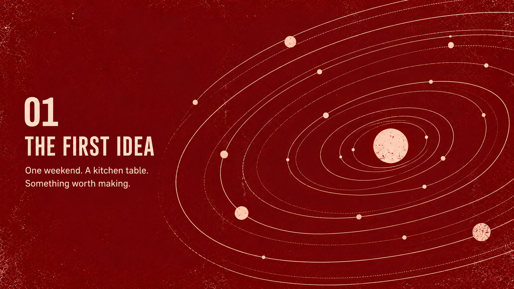
  • Orbit Press section slide made by Decky: oxblood-red background, condensed cream caps “01 THE FIRST IDEA” with the line “One weekend. A kitchen table.”, and a large illustrated orbit diagram of planets on the right.

    The first idea

    Orbit Press · Slide · Inputs: Brand template (.pptx) and guidelines (PDF), workshop outline

    A numbered section opener. The orbit diagram fills the right side to keep the cosmic illustration theme going.
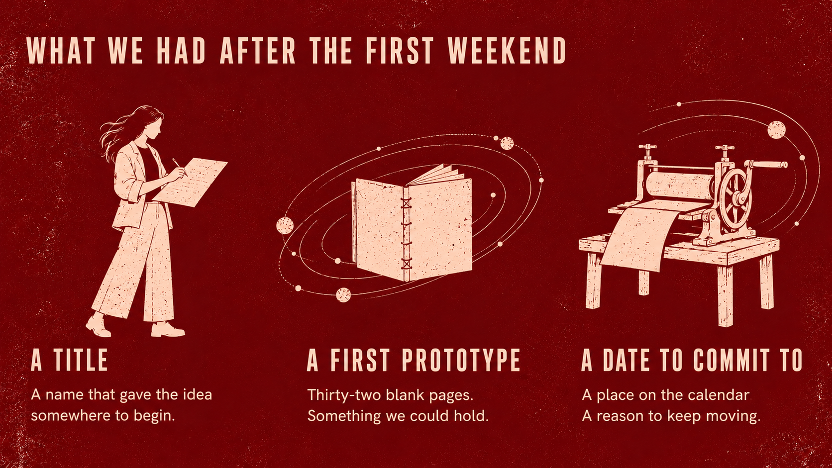
  • Orbit Press three-column slide made by Decky: oxblood-red background, condensed cream caps “WHAT WE HAD AFTER THE FIRST WEEKEND” over three illustrations — a woman reading, a stitched book, a printing press — labeled A Title, A First Prototype, A Date to Commit To.

    After the first weekend

    Orbit Press · Slide · Inputs: Brand template (.pptx) and guidelines (PDF), founder story notes

    A three-part story told with illustrations. Each column pairs a blush line drawing with a condensed caption.
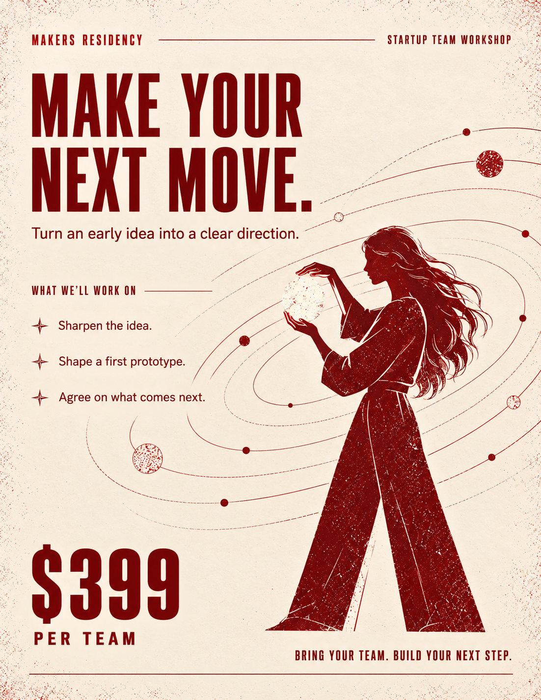
  • Orbit Press workshop flyer one-pager made by Decky: blush-cream textured page, oxblood condensed caps “MAKE YOUR NEXT MOVE.”, a three-item list of what the workshop covers, a large “$399 per team” price, and an oxblood illustration of a woman holding a glowing orb.

    Workshop flyer

    Orbit Press · One-pager · Inputs: Brand template (.pptx) and guidelines (PDF), workshop details and price

    A printable flyer with the offer and price. The palette flips to oxblood on cream while keeping the same type and illustration.
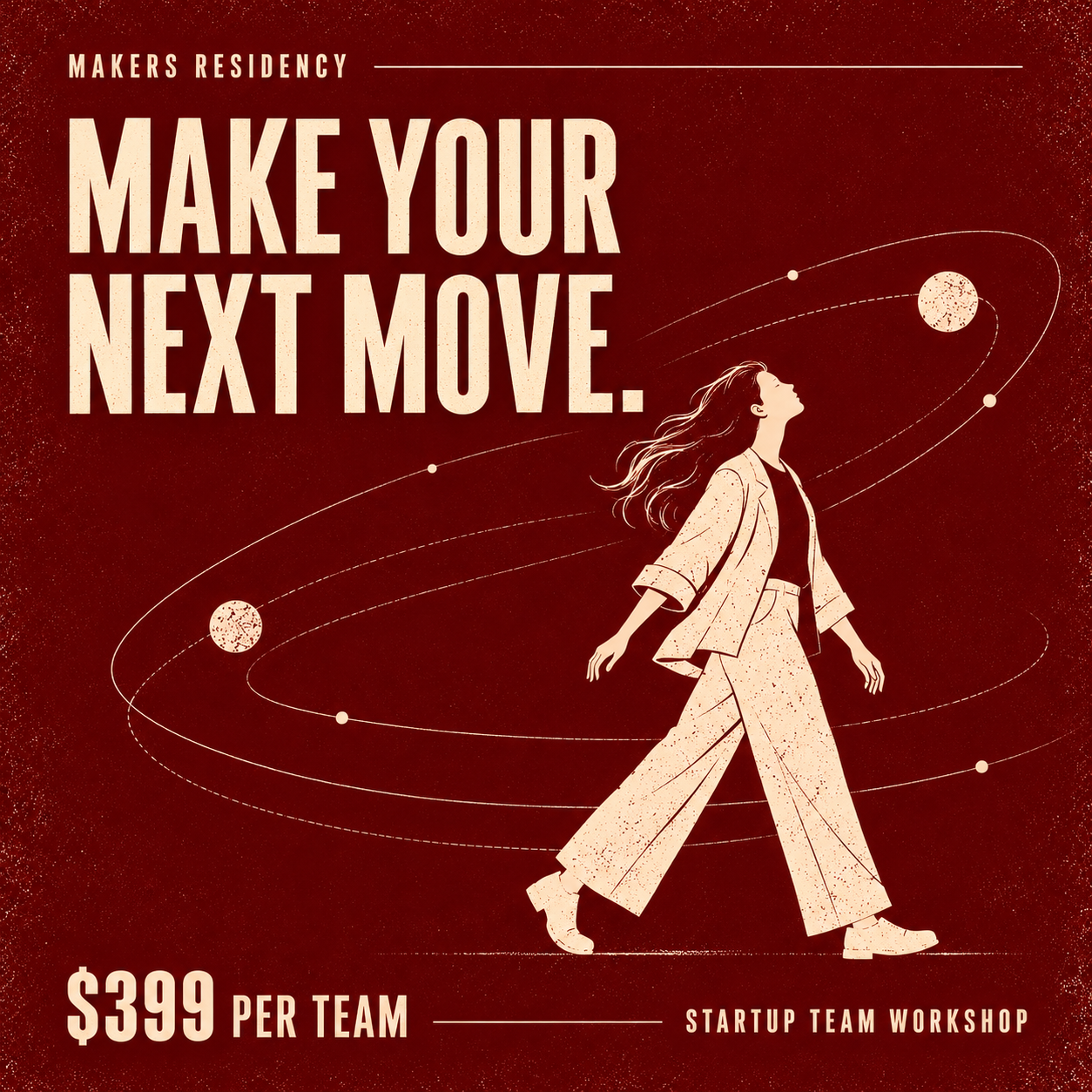
  • Orbit Press square social post made by Decky: oxblood-red textured background, cream condensed caps “MAKE YOUR NEXT MOVE.”, an illustrated woman striding among orbits, and “$399 per team · Startup team workshop” along the bottom.

    Make your next move post

    Orbit Press · Social post · Inputs: Brand template (.pptx) and guidelines (PDF), workshop details and price

    The workshop offer as a square post, with price and illustration kept from the flyer.

Strategic Consulting

  • Strategic consulting cover slide made by Decky: off-white background with a blurred emerald-green motion band across the top, heavy black sans caps “STRATEGIC CONSULTING FOR BUSINESSES READY TO” and a large green serif “Advance.”

    Ready to advance

    Strategic Consulting · Slide · Inputs: Brand template (.pptx) and guidelines (PDF), company overview (PDF)

    A consulting deck cover pairing heavy grotesk caps with a single green serif word. The motion band adds energy without extra imagery.
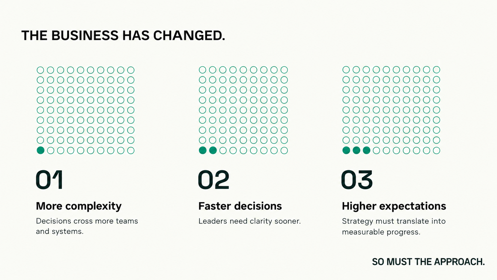
  • Strategic consulting slide made by Decky: off-white background, black caps headline “THE BUSINESS HAS CHANGED.”, three green dot-grid graphics with one, two and three filled dots above 01 More complexity, 02 Faster decisions, 03 Higher expectations.

    Three shifts

    Strategic Consulting · Slide · Inputs: Brand template (.pptx) and guidelines (PDF), company overview (PDF)

    A three-point argument shown with dot grids. Filled dots step up one per column to show the shift growing.
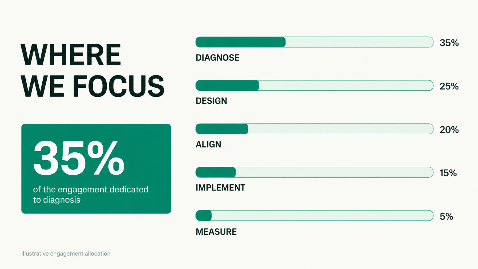
  • Strategic consulting allocation slide made by Decky: black caps “WHERE WE FOCUS”, an emerald card reading “35% of the engagement dedicated to diagnosis”, and five green progress bars — Diagnose 35%, Design 25%, Align 20%, Implement 15%, Measure 5%.

    Where we focus

    Strategic Consulting · Slide · Inputs: Brand template (.pptx) and guidelines (PDF), engagement breakdown (.xlsx)

    An engagement breakdown as progress bars. The largest share is pulled into a solid green callout card.

Passport
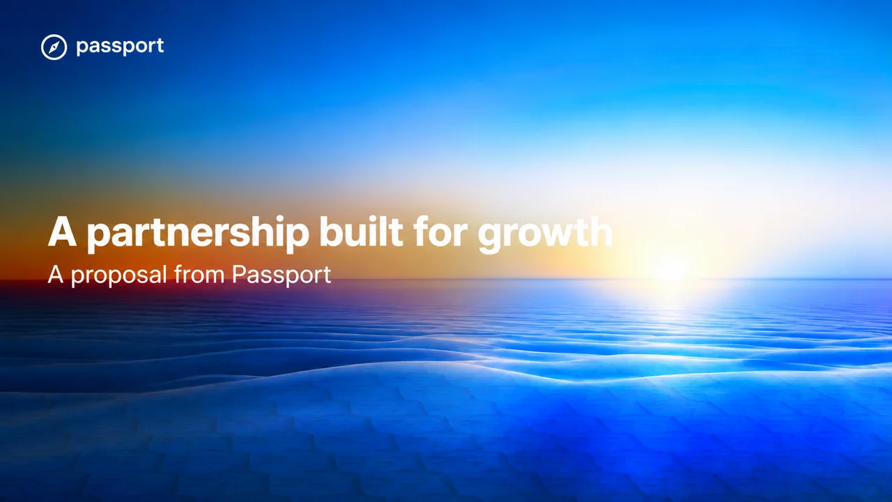
  • Passport proposal cover slide made by Decky: full-bleed photo of a glowing sunrise over a deep-blue ocean, white sans headline “A partnership built for growth” and “A proposal from Passport”, with the Passport logo top left.

    Partnership proposal cover

    Passport · Slide · Inputs: Brand template (.pptx) and guidelines (PDF), a request in Slack

    A proposal cover requested by tagging Decky in Slack. The photo and white sans type follow Passport's blue brand.
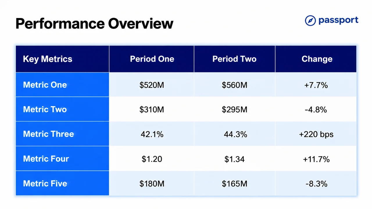
  • Passport performance overview slide made by Decky: white background, navy sans headline, and a table with bright-blue row labels comparing five metrics across two periods with a change column.

    Performance overview

    Passport · Slide · Inputs: Brand template (.pptx) and guidelines (PDF), metrics spreadsheet (.xlsx)

    A period-over-period metrics table. Blue label cells and navy headers keep it on brand and easy to scan.
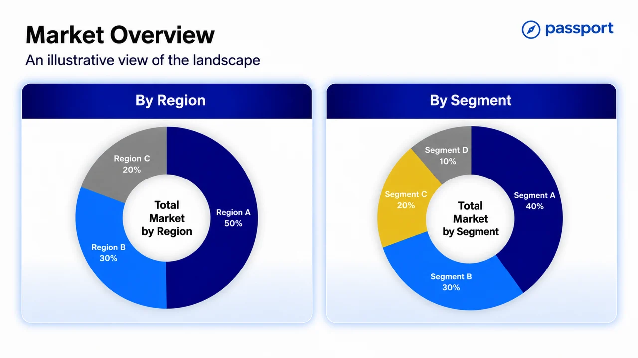
  • Passport market overview slide made by Decky: two side-by-side cards with navy headers, each holding a donut chart in navy, bright blue, grey and yellow — market split by region and by segment.

    Market overview

    Passport · Slide · Inputs: Brand template (.pptx) and guidelines (PDF), market data (.csv)

    Two donut charts comparing the market by region and by segment, colored with Passport's blues plus one accent.

Northline
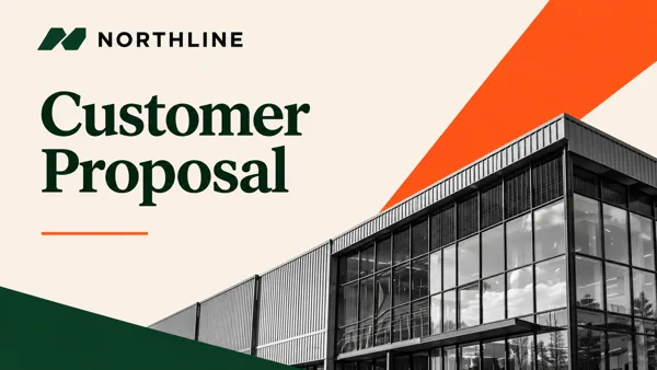
  • Northline customer proposal cover slide made by Decky: cream background, deep-green serif title “Customer Proposal” with an orange underline, a black-and-white photo of a modern glass building cut by bold orange and green diagonal bands.

    Customer proposal

    Northline · Slide · Inputs: Brand template (.pptx) and guidelines (PDF), building photos

    A proposal cover made from a template and two building photos. Decky turned the photo black and white and framed it with Northline's orange and green diagonals.
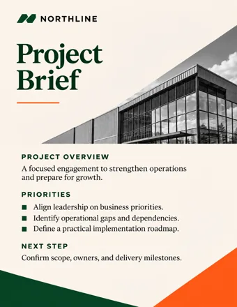
  • Northline project brief one-pager made by Decky: cream page, deep-green serif title “Project Brief”, a black-and-white building photo, sections for project overview, priorities and next step, with orange and green diagonal corners.

    Project brief

    Northline · One-pager · Inputs: Brand template (.pptx) and guidelines (PDF), project notes, building photos

    A one-page brief with overview, priorities and next step. Diagonal color corners and the serif title match the proposal deck.
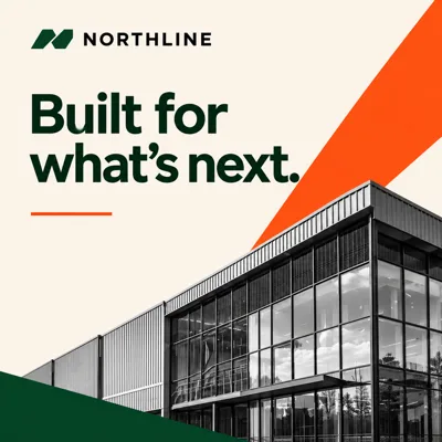
  • Northline square social post made by Decky: cream background, heavy deep-green sans headline “Built for what's next.” with an orange underline, above a black-and-white building photo framed by orange and green diagonals.

    Built for what's next

    Northline · Social post · Inputs: Brand template (.pptx) and guidelines (PDF), building photos

    The proposal's look as a square post: bold headline, building photo and the brand's diagonal color bands.